About / Curator
Two questions about
a paper, kept apart.
Quality asks whether the work is sound. Impact asks whether it matters. Curator scores them separately, on the same 1–10 scale, and never averages them into one number. This page explains why we score at all, how a score is made, what it does once it exists, and the studies that produced the shape of it.
Before the details
This is a work in progress, and it is meant to be. This page will change as the community changes it.
The premise
Why lay signal on science at all
Publishing-house science is slow, expensive and inefficient, and we all know it. Moving past it means finding new ways to lay signal on the work we produce.
Science is an evolving degree of understanding. Every scientific report is, at least at first, one story — one reflection, one group’s idea and interpretation of where our knowledge is moving. Curator exists so that individuals can take an active and formative part in sculpting those ideas into knowledge: not only producing one-time products, formerly called papers, but continuously shaping how they are read and what they are taken to mean.
That sculpting draws on stored human knowledge and insight — some earned through experience, some reachable only by connecting studies nobody has yet connected. It is how the speed and the accuracy of the work improve together, and how we work out which experiment might reveal the next breakthrough.
We need critical reading in addition to efficient publishing in order to do great science.
Three tenets
Better
Help scientists produce quality work. This is peer improvement and active editing of our own writing — catching mistakes and omissions before the work is exteriorised for consumption, so that we can be proud of what we release.
Faster
Help scientists surface good ideas sooner. That means using the pre-publication pathway, and more importantly compressing the time between the first submission of an idea and its full release. We aim to hold that under two months, on motivated peer improvement and editorial review.
Better again
Help scientists lay signal on that work, so it can be evaluated further and folded into the corpus of our understanding. Signal is what tells you how much to value a piece of work — and, relatedly, its authors as producers of science — and whether to read it at all.
On the objection that this cannot be measured
One may reasonably argue that any metric of scientific quality is unquantifiable. The difficulty is that a metric is already in use, and it is a far poorer one — a single brand name, standing in for the quality of one piece of science by way of the impact factor of an entire journal’s corpus.
Richer data can be used however each reader chooses, or ignored. A single number offers no such choice. That is the whole of the argument.
The separation
Why two numbers and not one
Quality
Do the experiments support the words? Is the science well executed? How much weight should this result carry, and is it likely to be true?
Impact
Should other people read this? Does it offer a fresh angle, a critical tool, or a formative insight into the way the world works?
The two come apart in both directions. Work that carefully reproduces an older result can be high Q and low I — valuable precisely because it confirms something, without moving the field. Work that opens a new direction can be high I and subpar Q, especially when the confirming experiment is not yet achievable.
Below a minimal level of Quality there is little reason for anyone to read a paper at all. Above it, Impact is a separate argument.
There is a second reason to keep them apart, and it is empirical rather than philosophical: scientists agree with each other far more about Quality than about Impact. Q is close to an objective reading of the methods. I depends on the reader’s field, experience and taste. Averaging a tight distribution with a wide one hides exactly the disagreement that is worth seeing.
Leaving a signal
The bee, or the full review
Curator draws a hard line between noticing a paper and judging it. Judgment lives in the two survey forms, and only there. Noticing has its own gesture, and it takes one tap.
Buzzing
At the top of every manuscript sits a bee. Tapping it marks the paper as one people are buzzing about — the water-cooler signal, the paper you brought up at lunch or sent to a colleague without writing a review. Tap again to take it back.
The manuscript-top area, complete. The bee is the only control that lives up here now, and it is not a score: buzzing moves no Q, no I, and no feed multiplier derived from either. It says people are talking, and how many.
The full review
The Impact tab opens a form in two parts: an upper part that steers who the paper reaches — your expertise, which impact features apply, expected audience, readership keywords — and a lower part that ends in the number: four scored subsets you annotate, then your overall, entered on a slider. Only the slider makes the number. The Quality tab is one required score with twelve optional sub-rubrics behind it. Both are drawn out in Under the Hood, below.
Only the lower part of the Impact form moves the posted score. Everything in the upper part — features, audience, keywords — steers which colleagues see the paper, whether or not it ever changes the number.
Under the hood
How an Impact score is made
Your posted Impact is a number you choose yourself, on a slider, after the form has walked you through what it should be made of. The subsets come first and the overall comes last, so the parts inform the whole rather than justify it — but the parts never touch the arithmetic. The slider alone is the score.
Specialist in this field · Related field · Generalist / broad expertise · Other
Transformative impact · Significant technical advance · Valuable data resource · Fills critical knowledge gap · Clinical / therapeutic relevance · Novel mechanistic insights · Addresses urgent need · None
1–10. How wide is the readership — a handful of specialists, or a general scientific audience? This is scope, not quality, and it routes the paper toward readers near or far from your own centroid.
e.g. immunology, T cells, cancer therapy
Part one in full. Nothing above this caption moves the posted number — it decides to whom the paper is recommended, and why. The old Q1 notes field is gone from here on purpose: the one text field on this form now closes it, after the score.
Four scored subsets, clicked in whole points on the shipped ten-box control — the endpoint anchors written beneath the row, the picked stop naming itself with the nearest anchor. The subsets are annotation and data: they inform your overall and tomorrow’s filtering, and they do not enter the posted score.
1 to 10, in steps of 0.1. Use the subsets above to figure it out; the shapes below show where the old journal tiers land.
One slider. Drag it past 8 and the dot at the centre of the thumb becomes a star ★ — the scale does not change; the thumb simply admits what you are claiming.
Calibration, not data: where a paper from each of the legacy journal tiers would land, drawn from the look-up table in Provisional Numbers. Niche runs 4.8–7.5, near-symmetric around its thickest point at 6. Field Specific runs 6–8, thickest at 6.2. Highest Tier runs 6.5–10, thickest at 7.5 and very thin past 8.75.
The one text field on the form, and it closes the form — your specific feedback about the paper. Optional, unless your overall is below 6 or above 8: then at least 120 characters are required.
Part two in full. The subsets are clicked in whole points; the overall alone is the score, placed to a tenth; the notes close the form.
Extremes carry homework
An overall below 6 or above 8 turns the notes field from optional to required, with a minimum of 120 characters. The middle of the scale is where most papers live and a bare number suffices; the edges are claims, and claims come with reasons.
What is posted is what you placed: your review’s Impact is your Q6, to the tenth. The four subsets above it never enter the arithmetic — they are annotation, for readers and for the record, and you weigh them in your own head on the way to the slider. The paper’s community Impact is the average of everyone’s, and it floats as reviews accumulate. There is no formula between your hand and the number.
Under the hood
How a Quality score is made
Quality has one posted number and twelve optional expansions. The posted score answers a single question: overall, the data support the conclusions presented in the paper. One to ten, whole numbers.
Whole numbers, clicked on the shipped ten-box control — no slider here.
The same calibration idea as the Impact slider, with one shape instead of three: we expect most papers that have been through peer improvement to land between 6.5 and 8.5, with a mean near 7.5 — tapering all the way to 10 but very thin past 9, and thinning to almost nothing below 6.
Beneath it sit twelve sub-questions, each scored the same way and each optional — whether the title and abstract are supported, whether every figure’s conclusions hold, whether confounders were accounted for, whether the controls, sample sizes and statistics are appropriate, whether the methods permit replication, and whether the writing and references do their job.
There is one place the form insists. Scoring below six means claiming the work sits under the standard of the lowest tier of journals, and Curator will not accept that as a bare number: the sub-questions and a written note all become required, and the note must run at least 120 characters. A serious accusation should carry its reasoning.
A written note is also required on every new review, whatever the score — during initial review of a new manuscript, considering quality in words is the peer-improvement half of the work, not an optional extra.
Under the hood
What your score actually does
A signal is not a rating that sits on a page. It moves three things.
It changes what people see
Impact is a multiplier on where a paper lands in other scientists’ feeds. A well-reviewed paper can be promoted several times over a poorly reviewed one. This is the most direct consequence of a review, and the least visible. The bee does none of this — buzzing shows a count and moves no ranking derived from Q or I.
It feeds the Hive
A review is one of the three signals that can unlock a paper’s Hive read — the synthesis of what the community actually concluded, alongside discussion and published journal club summaries. The Hive opens once two different people have contributed. Your review is frequently the one that opens it.
It counts as your work
Reviews accumulate on your profile as contributions and advance you through Reader, Contributor, Scholar and Curator. Scholarship of this kind has never had a ledger. Here it does.
Provisional numbers
The number in parentheses
Every paper arriving in Curator carries an estimate before anyone has read it, derived from one fact: the journal it appeared in. It is set in italics, in parentheses, next to Curator’s own score.
(Q 7.2 I 6.2) Curator Q: N/A and I: N/A
Since we are trying to shift away from journal brand as a measure of worth, the challenge of equating a name with a series of numbers first deserves a brief look at the value of a name. Below shows the variance in the citation index of individual papers for two journals. Focusing on the high-impact first one, we all note that not all papers in these journals have the same value (as measured by citation index, given its own caveats) as the journal brand itself.
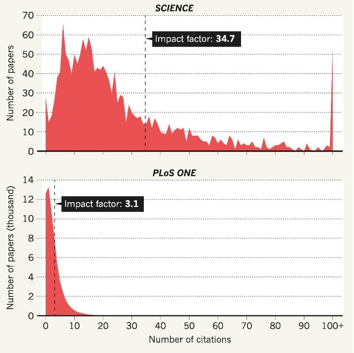
Based on the two very small studies done and described in Provenance below, we will initially be using the following table as an origin of the values in italics.
| Tier | Examples | Quality | Impact | ||||
|---|---|---|---|---|---|---|---|
| DSP | Sinai | Posted | DSP | Sinai | Posted | ||
| Highest Tier IF > 42 | Science, Cell, Nature, Lancet | 4.3 | 4.1 | 8.4 | 3.1 | 4.3 | 7.4 |
| Field Specific IF 9–42 | Cancer Cell, Nat. Immunol., Immunity | 4.0 | 3.2 | 7.2 | 2.8 | 3.4 | 6.2 |
| Niche IF 4–9 | Cell Reports, JI, EJI, PLoS One | 3.3 | 3.3 | 6.6 | 2.6 | 3.4 | 6.0 |
These three tiers — Highest Tier, Field Specific, Niche — are the same three shapes drawn under the Overall Impact slider. The violin centres are the Impact column of this table; the calibration a reviewer sees while placing a score is the same evidence, in the same units, as the estimate a paper wears before anyone reviews it.
Three bands, and only three, because that is all the evidence supports. Reviewer-to-reviewer variability within any single impact-factor band turned out to be wide — as wide as the gap between the bands themselves, and familiar to anyone who has watched two referees split on the same submission. Finer bins would be false precision. Three is as much resolution as the data carries, and arguably one more than it has earned.
The typography is the argument. Italic and parenthetical is a guess about a journal. Upright and bold is a judgment about this paper. The moment anyone reviews it, the second number replaces N/A and the two can be compared — which is the entire point of the exercise.
Applying these retroactively on the basis of brand is a weakly supported estimate, and we would rather say so on the page than in a footnote. It survives for one reason: it is still better than the alternative of showing nothing, and it makes visible how poor a surrogate journal brand is on a per-paper basis.
One end of the literature has no estimate behind it at all, because nobody has studied it. No analysis to date has characterised the relationship between brand and assessed quality for paper-mill journals. Work arriving from a venue below an impact factor of three therefore enters at Q 5, I 5 — a placeholder, not a finding, and among the first things Curator’s own data should be able to replace.
Provenance
How we got here
None of this was designed in the abstract. The shape of the two scales, the decision to separate them, and the numbers in the look-up table all came out of two studies of working scientists reviewing real manuscripts.
The 2024 Discovery Stack Pilot (DSP)
SolvingFor commissioned a small-scale trial of two things at once: peer improvement — a shift in ethos toward raising a manuscript to its highest standard before it goes public, which is what peer review was theoretically always meant to do — and a Q/I system placing numerical values on a piece of science.
Fifty Quality reviews and 112 Impact reviews across eighteen manuscripts submitted to bioRxiv and to journals. Every reviewer worked inside the field of the paper they read. Each manuscript drew at least two Quality and five Impact reviews.
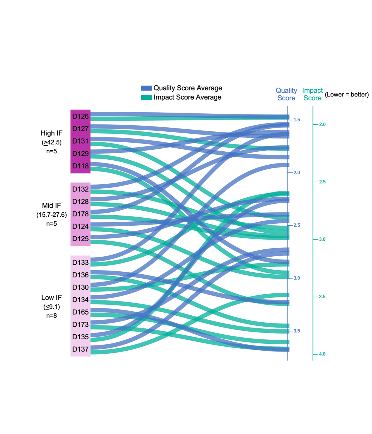
Two findings shaped everything that followed. Authors read the importance of their own work reasonably well: the Impact curves are relatively flat, meaning people submitted to roughly the tier their peers agreed the work belonged in. But the Quality curves cross constantly. Papers submitted to lower impact factor journals frequently earned Quality scores comparable to top-tier submissions — a fact the current system has no way of recording.
The spread in Quality scores was smaller than the spread in Impact scores. Scientists can agree on whether the science is good. They agree far less about what will turn out to matter.
The study is underpowered and we treat it as a source of starting estimates rather than conclusions. One incidental number is worth recording anyway: eighteen months after the reviews were collected, six of the papers still had not been published anywhere.
The Mount Sinai preprint journal club
A second dataset, arrived at independently, and reassuringly close in structure. The Mount Sinai preprint journal club evaluates bioRxiv submissions much as the DSP pilot did, with one instructive difference in method: where DSP built its Q and I out of composites of several queries, Sinai asks readers for a single number on each of three axes and nothing more. Five stars is best throughout.
Please evaluate the experimental design, the quality of the data, and how well they support the authors’ conclusions.
Please rate the novelty of the study and the originality of the results.
How likely do you think this study is going to impact its research field, and immunology in general?
The Sinai instrument. Its one-number-per-axis simplicity is the direct ancestor of the two posted numbers on every Curator manuscript — and of keeping the thirty-second gesture, the bee, honest about not being a score at all.
Two of those three turned out to be well-approximated by one; across thirty-two papers, novelty and significance moved together almost perfectly — an average deviation of four percent.
So Curator folds them into the single Impact measure. There is a presentational reason as well as an empirical one: two numbers on a manuscript page is tractable and three is not, and a reader glancing at a paper should meet Quality and Impact, not a panel. Nothing is discarded in the fold: novelty keeps its own subset inside the long form — Impact novelty, Q5d above — where it remains available for filtering papers into your feed by the specific kind of importance you care about.
What happens next
Ten points, and a system that studies itself
Why the scale runs to ten
Both studies used five points, and five points proved cramped. The compression bit hardest in the middle, where separating moderate work from lower-tier work collapsed into a single step — precisely the distinction a working scientist most often needs to make. A wider scale spreads those judgments out, and the slider’s tenths spread them further: the difference between a 6.8 and a 7.4 is one a reviewer can feel, and now one the instrument can record.
There is also a human element we see no reason to pretend away: people reach for a ten in a way they do not reach for a five. A system trying to displace journal brand should take every appeal to scientists as humans that it can get.
Machine readers, clearly labelled
Alongside the human signals, Curator generates an AI assessment of each paper, shown in its own A tab — similar in spirit to others emerging in the field. We anticipate opening that surface to multiple AI engines as assessment toolboxes are built. Machine scores stay in the machine column: they never enter the human Q, the human I, or the violins.
What the platform can settle that the studies could not
The estimates on this page are the best data scientists currently have, which is a comment on the state of the field rather than a claim about the studies. Curator is in an unusual position to improve on them. As post-publication scores accumulate, it can model the real relationship between journal brand and field-assessed quality — including at the paper-mill end of the literature, which no study has attempted at all.
Existing work already suggests most papers deviate from the mean impact factor of the journal that carried them, and that the deviation is largest in the high-tier journals. An ever-improving dataset of post-published scores set against brand is among the first things this platform should produce — and the violins under the slider are its first customers: today they are drawn from the look-up table, and they should be redrawn from Curator’s own accumulated reviews the moment those are the better evidence.
Who decides
Because we own our own data on this platform, we can study our own system, as scientists should. Curator periodically convenes a roundtable — asynchronous or in person — of its academic founders and super-users, to debate the nature of knowledge, argue with this evidence, and revise the method. The scientific advisory board grows alongside it.
This is a work in progress, and it is meant to be. This page will change as they change it.